

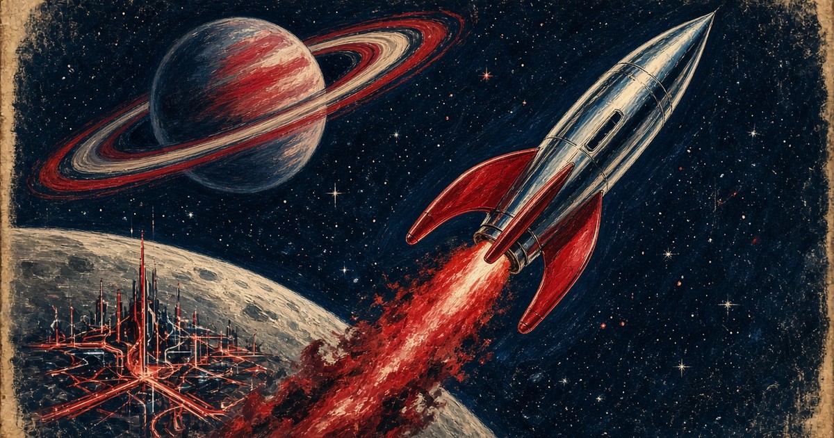
Some futures arrived as dust jackets. This Opinion piece is our argument about twenty science-fiction novels that still shape how engineers, lawyers and politicians talk about tomorrow — and ten favourites we keep pressing into people’s hands — read through the cover art that sold them. Awards and the 1998 Locus all-time poll are the spine. The pictures are the gossip.
Ad: this article contains affiliate links, marked (Ad). If you buy through them, we earn a commission. It does not affect what we say. As an Amazon Associate we earn from qualifying purchases.
How we choose what to recommend: How we review and Independence.
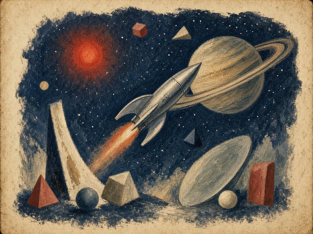
How we picked the twenty — and why each entry is here
Critical standing here means dated receipts, not vibes. We anchored Part 1 on the 1998 Locus all-time best SF novel poll (opens in a new tab) (results published in Locus, August 1998; votes limited to books published before 1990), then cross-checked Hugo and Nebula Best Novel wins and — for Asimov’s Foundation sequence — the special 1966 Hugo for Best All-Time Series. Where a later book (Snow Crash, The Three-Body Problem) sits outside that poll’s cut-off, we say so and lean on awards plus documented influence instead. Part 2 is openly personal: Barsoom, Conan and Moebius because pulp and Heavy Metal landmarks changed how SF looked even when they were not Hugo novels; the rest are Culture, Dick, hard SF and Mars favourites we actually press into people’s hands. This is Opinion: other shelves are possible; this is the one we will defend.
Cover reproductions are for criticism only. We host our own files, name the artist in the heading and the caption, and do not lightbox or hotlink. Where a living artist or estate sells prints of that painting, we keep the web copy small. Art-book affiliates live only in the separate list at the end — never beside a cover. Every image in this piece is a distinct jacket or original pulp; we do not crop a cover and show it twice. Each numbered entry states why it is on the list.
Part 1 — Twenty that changed the conversation
1. Frankenstein — Mary Shelley (1818) · art by Theodor von Holst (1831)
Why it is here: it is the template for every story in which a builder meets the thing he built and flinches — before rockets, before robots with three laws. On the 1998 Locus all-time list it sits at #48, not because it is minor, but because the poll was stuffed with mid-century paperback gods. Start here if you have never read it: the creature is eloquent; the horror is abandonment.
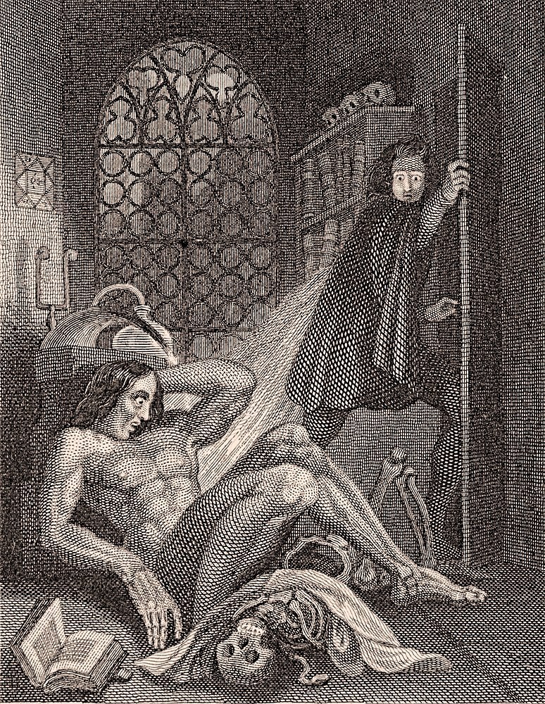
A diagonal blade of light cuts the room in half. On the floor, the creature has just woken — long hair, classical muscle, one hand to his head — while Victor bolts for the door. Those deep blacks are engraved cross-hatching packed until the paper gives up; highlights on the shoulder are stipple and thin open lines. Gothic SF learned to look expensive on cheap paper right here. Read it: Frankenstein (Penguin Classics (opens in a new tab) (Ad).
2. The War of the Worlds — H. G. Wells (1898) · art by Henrique Alvim Corrêa (1906)
Why it is here: Wells invents the invasion procedural — calm English counties, then heat-rays, then bureaucracy trying to keep the trains running while the sky falls. Locus 1998 #28. Every alien-landing news package still owes this book a pint.
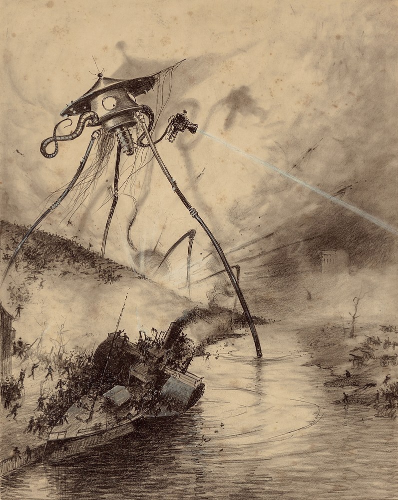
We are not hosting a Pearson dust jacket here. We are hosting Alvim Corrêa’s coppery legs, heat-ray cone and a city already half slag — the plate that taught the twentieth century what a Martian looked like when it was not a rubber suit. The composition puts the fighting-machine high in the frame so the ruined street becomes a stage; the technique is dense ink wash and etched line that still photographs as menace. The War of the Worlds (Penguin Classics (opens in a new tab) (Ad).
3. Brave New World — Aldous Huxley (1932) · cover design by La Boca
Why it is here: Huxley sells comfort, conditioning and a pharmaceutical smile. Babies grown in bottles, castes chemically set, unhappiness treated as a product defect — soma is the brand name for looking away. Soft capture, not the boot, and still the clearest literary model for a future that wins by making you happy enough not to notice.
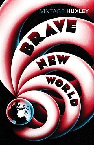
The Vintage jacket is almost polite: soft colour, restrained type, a tiny Earth trapped in the coils. La Boca’s studio language turns industrial tubing into a decorative spiral, so the future looks like packaging rather than a prison. That is the point of Huxley’s future — it looks like something you would put on a coffee table. Brave New World (opens in a new tab) (Ad).
4. Nineteen Eighty-Four — George Orwell (1949) · cover design by David Pearson
Why it is here: Orwell sells the boot and the telescreen. Locus 1998 #21. The Party rewrites the archive in real time and invents Newspeak so that dissent becomes grammatically awkward. Hard capture. Most modern platforms remix Huxley and Orwell in the same afternoon.
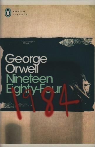
Pearson’s redesign treats the title as graffiti over a grainy face — the book as a defaced noticeboard. The composition is almost brutalist: one scrawl, one muted photograph, type that looks banned. Design Week and Penguin’s own redesign features still cite it when they talk about literary jackets that behave like protest posters. Confirm the current UK ISBN on the retailer page; Penguin reprints churn.
5. Foundation — Isaac Asimov (1951) · art by David Kyle
Why it is here: psychohistory — the fantasy that history has a differential equation and you are clever enough to solve it. Locus 1998 #4; the Foundation books took the 1966 Hugo for Best All-Time Series. Every think-tank slide deck that promises to “model” a civilisation owes Asimov a quiet apology; even DARPA’s early-2000s social-forecast programmes were joked about in the trade press as chasing psychohistory.
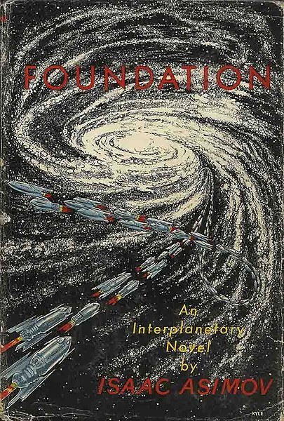
Kyle’s jacket (ink and gouache on board, documented in later auction notes) is a swarm of rockets curling into a spiral galaxy — no hero face, no ray-gun duel, just fleet geometry. Gnome Press used that kind of stark futurism sparingly; here the rockets are the argument: civilisation as logistics. Later Panther and Hardware-era Foss jackets are celebrated in their own right and live on the art-book shelf below; we host the landmark first because it is the edition that put the series into hardback as a parade of silver ships. Foundation (opens in a new tab) (Ad).
6. Fahrenheit 451 — Ray Bradbury (1953) · art by Joe Mugnaini
Why it is here: firemen who start fires; books as contraband; a society that burns its own memory because remembering hurts. Locus 1998 #29. Bradbury’s future is warm, suburban and terrifying — the censorship novel that still gets pulled whenever somebody bans a syllabus.
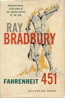
Mugnaini’s figure is still the book’s visual shorthand: a body made of pages, already half ash, drawn with the nervous line he brought from newspaper illustration into Ballantine’s early paperbacks. The SF Encyclopedia and Library of America features on the Bradbury–Mugnaini collaboration still hang this plate when they need to show what the novel looked like before the film posters arrived. Fahrenheit 451 (opens in a new tab) (Ad).
7. Childhood’s End — Arthur C. Clarke (1953) · art by Richard Powers
Why it is here: Overlords arrive, utopia follows, and humanity’s children evolve past their parents into something that does not write letters home. Locus 1998 #8. Clarke’s gift is making transcendence feel like a quietly administered extinction — still the cleanest English-language model for first contact as a civilisational endgame.
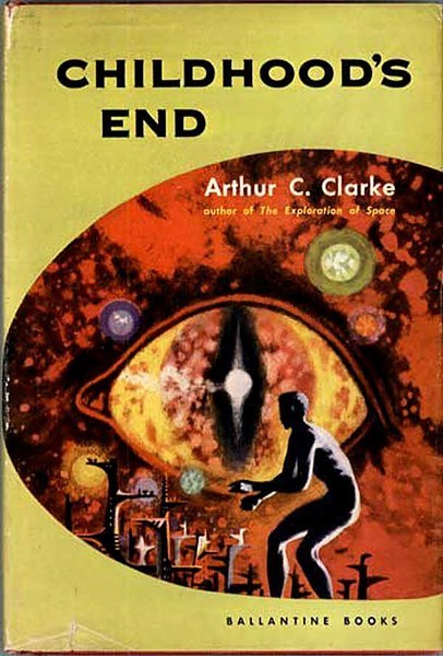
Powers turned Ballantine’s racks into a gallery of biomorphic dread: a surreal eye, a kneeling silhouette, colour washes that refuse pulp red. The SF Encyclopedia still hangs this jacket in its Powers gallery because it is the moment SF packaging stopped pretending to be an adventure magazine. Childhood’s End (opens in a new tab) (Ad).
8. The Stars My Destination — Alfred Bester (1956) · art by Richard Powers
Why it is here: Gully Foyle, jaunting, revenge as a renewable fuel. Locus 1998 #6. Cyberpunk before the word: a protagonist who remakes himself by sheer refusal to stay dead, and a prose rhythm later writers still steal.
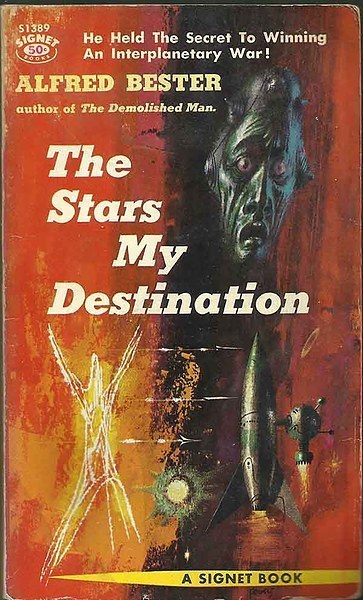
Same artist as Childhood’s End, different fever dream: anguished face, jaunte-figure and rocket dissolved into the classic Powers wash. The Signet jacket still gets pulled whenever someone needs to show what Powers looked like when SF stopped pretending to be adventure magazines. The Stars My Destination (opens in a new tab) (Ad).
9. Stranger in a Strange Land — Robert A. Heinlein (1961) · art by Ben Feder
Why it is here: a human raised by Martians returns to Earth and invents a religion, a vocabulary (“grok”) and a scandal. Hugo 1962; Locus 1998 #5. The book that escaped the genre ghetto into the counterculture bookshelf — and donated a verb to people who have never read it.
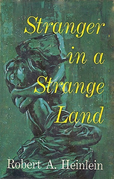
Feder’s Putnam jacket refuses pulp swagger: an abstract, almost sculptural figure on a dark green field, type set for a prestige hardcover rather than a news-stand spinner. The composition sells the novel as philosophy with a plot — which is exactly how it left the genre ghetto. Confirm the current UK ISBN on the retailer page; uncut and cut texts both circulate.
10. Dune — Frank Herbert (1965) · art by John Schoenherr
Why it is here: ecology as power politics; spice as the resource everyone will kill for; a desert that refuses to be a backdrop. Hugo and Nebula 1966; Locus 1998 #1. Still the book people mean when they say “worldbuilding”. Herbert’s Oregon-dunes research and Earth Day-era talks helped park the novel inside the early environmental movement as well as on the SF shelf.
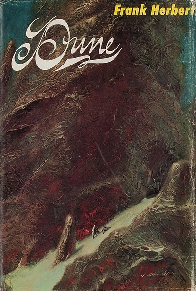
Schoenherr’s jacket sells loneliness at planetary scale: two tiny walkers under a cliff that does not care. The palette is mineral rather than heroic; the composition puts geology first and people second. That is still the honest Dune picture — and the plate the SF Encyclopedia treats as the landmark first. Dune (opens in a new tab) (Ad).
11. The Moon Is a Harsh Mistress — Robert A. Heinlein (1966) · art by Paul Lehr
Why it is here: lunar colony revolution, a sentient computer with a sense of humour, and the line about there ain’t no such thing as a free lunch. Hugo 1967; Locus 1998 #2. Libertarian parable or systems novel, depending on which friend you ask — either way it is still the book people reach for when they want politics on a vacuum stage.
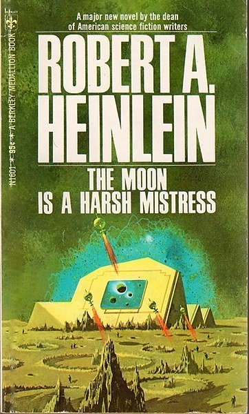
Lehr paints the Moon as a stage set for ideology: a stepped ziggurat on a green lunar plain, probe-ships hanging like punctuation, hard edges and airless light. The geometry does the talking — revolution as architecture — which is why Berkley’s N1601 still reads as the paperback that made Heinlein’s Luna look designed rather than sketched. Confirm the current UK ISBN on the retailer page.
12. The Left Hand of Darkness — Ursula K. Le Guin (1969) · art by Leo & Diane Dillon
Why it is here: gender as weather; diplomacy as survival; a planet of winter that forces two people to become a unit. Hugo and Nebula; Locus 1998 #3. Still the thought-experiment that bites — and the novel that made anthropological SF feel inevitable.
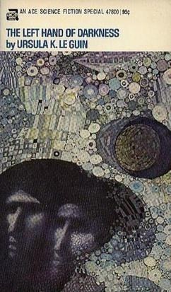
The Ace Special plate is all winter geometry: cool flat colour, two muffled figures sharing a horizon line, type that refuses pulp swagger. The Dillons treat Gethen as a design problem — kinship without costume drama — which is why the jacket still reads as the novel’s argument, not a movie poster. The Ace Specials are a syllabus; this one is the crown. The Left Hand of Darkness (opens in a new tab) (Ad).
13. Ringworld — Larry Niven (1970) · art by Dean Ellis
Why it is here: a megastructure so large it makes planets look like gravel. Hugo and Nebula; Locus 1998 #25. Hard SF as tourism: you come for the engineering, you stay for the sense that somebody already built the sublime. Later megastructure fiction still has to walk around this ring.
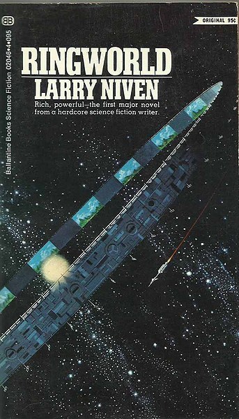
Ellis’s jacket is the one that taught racks what a ringworld looked like before CGI: a painted engineering diagram, needle ship for scale, the structure itself as the star. The composition is almost didactic — look, measure, believe — which is exactly the honest brief for Niven’s tourism-of-the-sublime. Confirm the current UK ISBN on the retailer page.
14. The Forever War — Joe Haldeman (1974) · art by Chris Moore
Why it is here: relativity as the real enemy — soldiers return from campaigns to a home front that has aged past them. Hugo, Nebula and Locus; Locus 1998 #12. Vietnam rewritten as physics homework, and still the war novel SF readers hand to people who think the genre cannot do consequence.
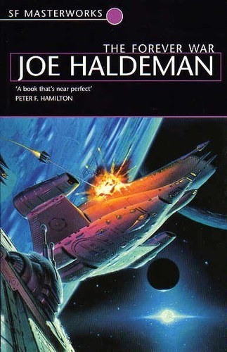
Moore paints the war as a traffic accident in vacuum: hard-edged craft, muzzle glare, no heroic pilot close-up. The Masterworks jacket keeps the novel’s joke intact — relativity hurts more than the enemy — by making the hardware look already late to its own funeral. The Forever War (opens in a new tab) (Ad).
15. The Dispossessed — Ursula K. Le Guin (1974) · art by Fred Winkowski
Why it is here: anarchist moon versus propertarian planet; a physicist who invents a new physics and finds both societies want to own it. Hugo and Nebula; Locus 1998 #19. Utopia as unfinished argument — still the political-philosophy novel SF reaches for when someone asks whether the genre can do ownership.
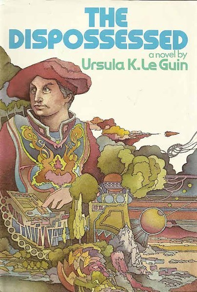
Winkowski’s first-edition figure is ornate against a sparse alien ground — ceremony pasted onto scarcity. The jacket sells Le Guin’s double world as a painted parable rather than a spaceship catalogue, which is the honest brief for a novel about ownership. The Dispossessed (opens in a new tab) (Ad).
16. Neuromancer — William Gibson (1984) · art by James Warhola
Why it is here: cyberspace, console cowboys, corporations as weather systems. Hugo, Nebula and Philip K. Dick Award; Locus 1998 #15. Gibson had coined “cyberspace” in the 1982 story “Burning Chrome”; the 1984 novel taught the internet how to feel noir before most readers had a modem, and later cyberpunk cinema — including The Matrix (1999) — still walks through rooms he furnished.
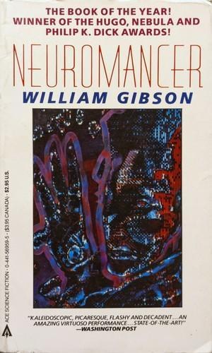
Warhola’s Ace face is the whole pitch: chrome highlights, jacked-in stare, city light as migraine. It is illustration as interface — the reader meets Case as a user already online — which is why the paperback still defines “cyberpunk jacket” in second-hand racks. Neuromancer (opens in a new tab) (Ad).
17. Ender’s Game — Orson Scott Card (1985) · art by John Harris
Why it is here: child soldiers, battle-school games that turn out to be real, empathy as a weapon. Hugo and Nebula; Locus 1998 #9. Still the book people argue about in the same breath as they recommend it — and the one military and leadership reading lists keep quietly photocopying.
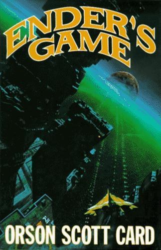
Harris paints scale as the joke and the threat: a tiny yellow fighter against a vast station, hard light, cold space. The composition is almost cruel — childhood as a speck under architecture — which is why Tor’s reuse of the earlier Drunkard’s Walk painting still reads as the novel’s true face. Christie’s later sale of the original only confirmed what paperback racks already knew. Ender’s Game (opens in a new tab) (Ad).
18. Hyperion — Dan Simmons (1989) · art by Gary Ruddell
Why it is here: Canterbury Tales on a pilgrimage toward a murderous metal angel. Hugo 1990; Locus 1998 #10. Structure as spectacle; the Shrike as a brand — still the epic that proves SF can do nested storytelling without losing the plot.
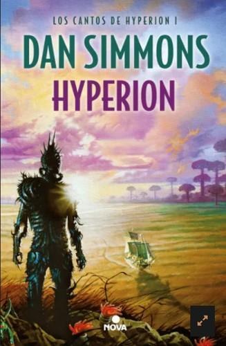
Ruddell’s Shrike is all silhouette and thorns against Time Tombs light: a metal angel drawn as negative space, sunset colour bleeding behind spikes. The composition makes the creature a brand before you read a page — which is why the painting became bookshelf-recognisable and earned a 1990 Chesley nomination for hardcover cover illustration. Hyperion (opens in a new tab) (Ad).
19. Snow Crash — Neal Stephenson (1992) · art by Bruce Jensen
Why it is here: outside the 1998 Locus cut-off, but impossible to skip. The Metaverse, avatars, pizza delivery as franchise warfare, linguistics as bioweapon. Stephenson’s 1992 coinage “metaverse” later walked into product decks from Second Life’s design talk through to Meta’s 2021 rebrand — the book that donated vocabulary to actual roadmaps.
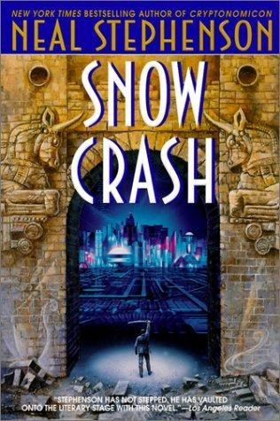
Jensen paints an Assyrian arch opening onto a neon grid: ancient gate, future street, one composition arguing that language and code are the same weather system. The palette is night-market cyberpunk without the chrome cliché; the typography rides the painting rather than fighting it. Dec racks still point at this plate when they mean “that Snow Crash cover”. Snow Crash (opens in a new tab) (Ad).
20. The Three-Body Problem — Liu Cixin (2008; Ken Liu tr. 2014) · art by Stephan Martinière
Why it is here: Cultural Revolution trauma meeting cosmic sociology; a video game that is not a game; first contact as a civilisational trap. Hugo Best Novel 2015 — the book that made Anglophone shelves notice contemporary Chinese SF at scale, and the one cosmic-panic novel of the 2010s that escaped the genre aisle into general conversation.
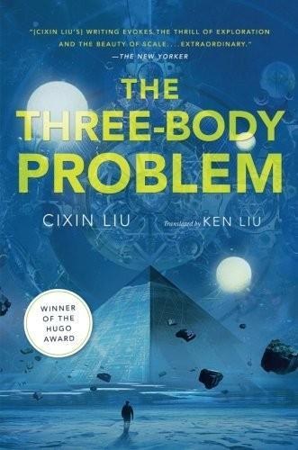
Martinière builds a cold pyramid under three suns: astronomical instruments, ice, scale that feels measured rather than shouted. The composition is an orrery turned into architecture; the palette is winter science. Tor’s Reactor cover reveal treated it as an event for a reason — this is how twenty-first-century cosmic dread got a face that was not another spaceship nose-cone. The Three-Body Problem (opens in a new tab) (Ad).
Part 2 — Ten favourites (and the jackets that sold them)
Landmarks are the syllabus. Favourites are the books we actually press into people’s hands — including three pulp and comics landmarks that changed how SF looked even when they were not Hugo novels. Each one earns its place for a stated reason.
1. A Princess of Mars — Edgar Rice Burroughs (1912/1917) · art by Frank Frazetta
Why it is here: sword-and-planet as a lifestyle — John Carter, Dejah Thoris, and a Mars that is equal parts desert and opera. Without Barsoom, a lot of later planetary romance has nothing to plagiarise; Frazetta’s 1970 painting is why the reprints still move.
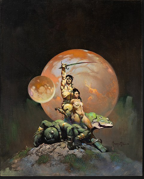
Frazetta stages impact first: bodies in motion, desert light, anatomy that refuses to whisper. The composition is a diagonal of action against a sparse Martian ground; the brushwork is wet and confident. No print-shop links — the estate sells fine-art prints; our copy stays small on purpose. Confirm the current UK ISBN; Burroughs editions churn.
2. Conan (Lancer-era) — Robert E. Howard · art by Frank Frazetta
Why it is here: the barbarian as brand. Frazetta’s Lancer covers did more for Howard’s afterlife than a dozen scholarly editions. If you have ever seen a warrior on a rock under a sick sky, you have seen this argument.
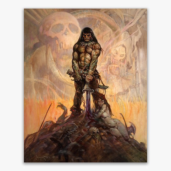
The 1966 painting builds a pyramid: Conan at the apex, sword pommel down, a triangle of fallen foes and a soft-focus companion at his feet, skulls and a lonely castle ghosted behind. Sharp focus on the barbarian, soft focus everywhere else — photographic thinking in oil. Brown and green muscle tones against pale firelight; the whole thing reads as triumph without needing a caption. The Coming of Conan the Cimmerian (opens in a new tab) (Ad) is a modern doorway; the painting above is the reason the doorway exists.
3. Heavy Metal / Métal Hurlant — Moebius
Why it is here: not a novel — a magazine and a look. Moebius (Jean Giraud) taught European comics and Hollywood storyboards that SF could be desert silence, crystalline machinery and jokes told in the architecture. Special-effects budgets still chase that dream logic.
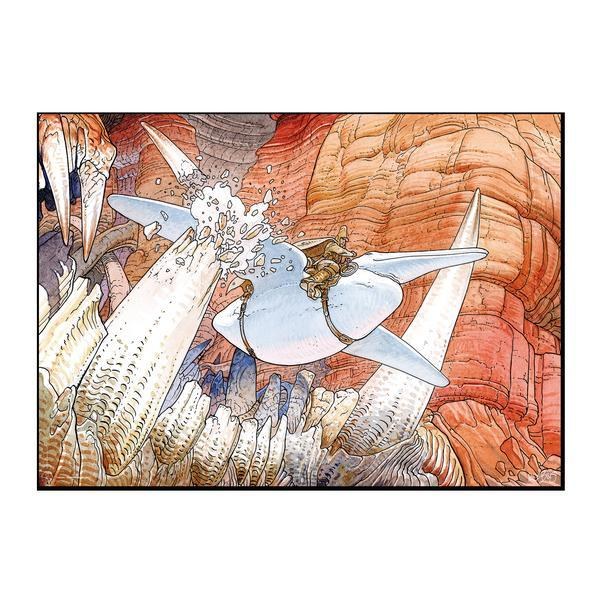
The linework is the argument: clean contours, impossible space, colour that feels air-conditioned. Composition floats rather than anchors; the eye wanders into architecture that refuses Euclidean manners. Surveys that include Moebius live only in Further reading below — never as a poster shop next to this plate.
4. The Player of Games — Iain M. Banks (1988) · art by Mark Salwowski
Why it is here: best on-ramp to Banks’s Culture — a bored games genius is volunteered to represent a post-scarcity civilisation in an empire where a board game is the state. Minds (shipboard AIs) do the real politics offstage; benevolent machine intelligence here is the furniture that lets humans live a life of culture rather than a life of scarcity.
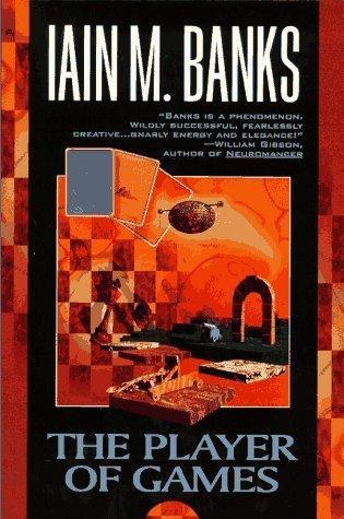
Salwowski paints the Culture as a surreal game-board landscape: floating platforms, orange sky, pieces that might be architecture or moves. The composition is wraparound ink-on-board thinking (his own gallery lists the piece at roughly 72×48 cm); the palette is warm dusk rather than chrome. It sells Banks’s joke — politics as a game you did not know you were playing — without a single military nose-cone. The Player of Games (opens in a new tab) (Ad).
5. Do Androids Dream of Electric Sheep? — Philip K. Dick (1968) · art by Harry Sehring
Why it is here: bounty hunter, fake animals, empathy tests, the nagging suspicion the tester is the test. The film Blade Runner is a cousin, not a photocopy — and the novel remains the cleaner argument about what counts as a person when the paperwork lies.
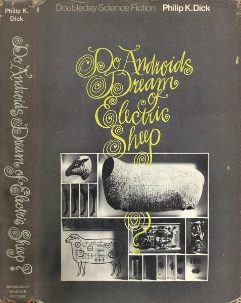
Sehring sells the novel as a technical nightmare: sheep drawn like a kit diagram, neon-yellow title curls, hardware where pastoral should be. The composition is deliberately wrong-footed — farm animal as schematic — which is the whole Dick joke in one jacket. Do Androids Dream of Electric Sheep? (opens in a new tab) (Ad) · Blade Runner (film-tie edition of the novel (opens in a new tab) (Ad).
6. Gateway — Frederik Pohl (1977) · art by Boris Vallejo
Why it is here: a prospector’s lottery inside an alien space station, therapy sessions that hurt, and a Hugo–Nebula–Locus triple crown. If “I signed a waiver and now the stars hate me” is your mood, start here — it is still the cleanest Heechee doorway and a cover-art landmark for Vallejo’s SF period.
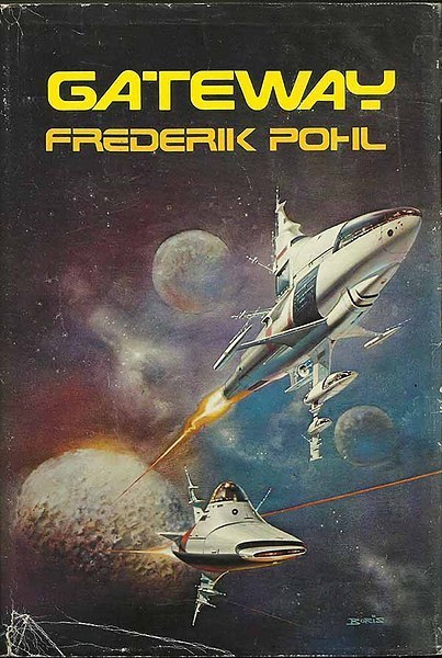
Vallejo paints white ships against nebula weather and cratered moons: travel-poster glamour with a funeral underneath. The composition stacks craft like jewels on black velvet; the technique is the polished fantasy realism he brought from barbarian covers into SF racks. Living-artist sensitivity applies — our copy stays at the fair-dealing cap, with no print-shop link. Confirm the current UK ISBN on the retailer page.
7. Blindsight — Peter Watts (2006) · art by Thomas Pringle
Why it is here: first contact as a thesis that consciousness might be evolutionary malware — useful for bonding apes, expensive for dealing with truly alien intellects. Hard SF with the bedside manner of a coroner, and still the twenty-first-century first-contact novel we hand to people who liked Clarke and want the lights turned down.
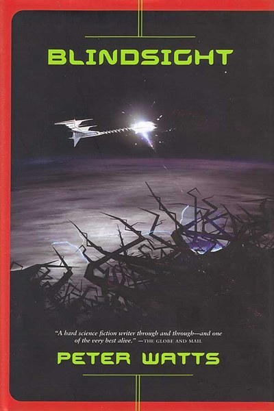
Pringle’s Tor first edition treats the void as a medical chart: a needle ship, thorned structures, cold colour that feels clinical rather than adventurous. Watts has said Tor worked through roughly a dozen concept sketches; the published plate keeps the hardware ominous instead of Buck Rogers bright. The composition is vertical threat — ship as syringe — which is why the SF Encyclopedia gallery still hangs it as the Tor first. Firefall (opens in a new tab) (Ad) (UK readers often find Blindsight here).
8. Accelerando — Charles Stross (2005) · art by Stephan Martinière
Why it is here: the Singularity told as three generations of increasingly illegible capitalism. Lobsters get uploaded and unionise; venture capital becomes a planetary weather system; grandchildren inherit problems that no longer fit inside a skull. Still the most readable English-language acceleration novel that admits the spreadsheet is the monster.
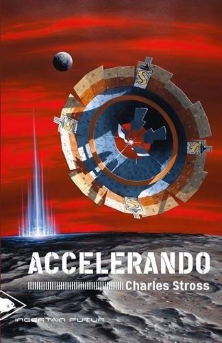
Martinière again, different sky: a ring habitat under red weather, scale language shared with his Tor Three-Body work. The composition sells post-human infrastructure as landscape; the palette is alarm without pulp. It is the honest jacket for a novel about capitalism that outruns its users. Accelerando (opens in a new tab) (Ad).
9. The Man Who Japed — Philip K. Dick (1956) · art by Ed Emshwiller
Why it is here: Ace Double D-193 — a Moral Reclamation society that polices joy; a prank that becomes politics. Dick before the android sheep, already allergic to enforced virtue. We preferred this Emsh plate over a weaker modern Diamond Age scan — the Stephenson novel is still worth reading; this section is about the picture.
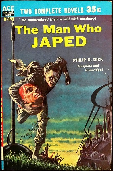
Emsh packs the Ace Double with pulp colour chemistry: saturated figure, crowded props, the joke of Moral Reclamation sold as carnival signage. It is Dick before the sheep, already allergic to enforced virtue, and the plate shows it without a single tasteful beige panel. Pulp Doubles circulate as used stock; confirm the listing before you click.
10. Red Mars — Kim Stanley Robinson (1992) · art by Don Dixon
Why it is here: terraforming as committee work — scientists, corporations, revolutions and dust storms that do not care about your mission patch. Robinson treats Mars settlement as engineering plus labour politics plus ecology, and Dixon’s astronomical realism is why the Spectra paperback looked like a briefing deck rather than a pulp fantasy.
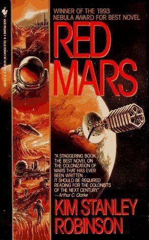
Dixon paints Mars as a globe you could brief from: accurate light, spacecraft with an exploration strip, no barbarian posing on a rock. The SF Encyclopedia entry on Dixon notes the astronomical-illustration tradition he brought into paperback racks; the composition is orbital rather than operatic. Confirm the current UK ISBN on the retailer page; editions churn.
Further reading: the art books
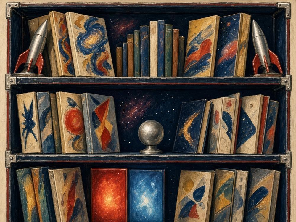
These are surveys and monographs — including artists whose jackets we discuss above and the Hardware-era Foss look we point to rather than host beside Foundation. Per house rules, art-book links sit only here — well away from the cover sections. No print, poster or merchandise links anywhere in this article.
- Hardware: The Definitive SF Works of Chris Foss (opens in a new tab) (Ad) — Foss ships we did not host next to Foundation; this is where that celebrated Hardware look lives.
- Sci-Fi Art: A Graphic History (opens in a new tab) (Ad) — Holland et al.; broad survey of the paperback and magazine look.
- The Art of the Pulps (opens in a new tab) (Ad) — Ellis / Hulse / Weinberg; magazine and paperback archaeology (confirm UK stock on the day).
- The Art of Richard Powers (opens in a new tab) (Ad) — Jane Frank / Paper Tiger; more of the Powers catalogue beyond the two Ballantine/Signet jackets above (confirm UK availability).
A short shelf if you only buy four
Dune (opens in a new tab) (Ad) for ecology-as-power; Neuromancer (opens in a new tab) (Ad) for the network nightmare that became a workplace; The Left Hand of Darkness (opens in a new tab) (Ad) for the social thought-experiment that still bites; The Three-Body Problem (opens in a new tab) (Ad) for the twenty-first-century cosmic panic. Then borrow a Frazetta paperback from a relative and apologise later.
Paperbacks are propaganda with a spine. Schoenherr sold loneliness; Powers sold modernist dread; Frazetta sold impact; Moebius sold the dream logic that special-effects budgets still chase; Emsh sold pulp as colour chemistry; Martinière sold cosmic scale to the twenty-first century; von Holst, a century earlier, sold the laboratory as a crime scene. The novels above changed the future by changing the metaphors engineers and voters reach for under pressure — cyberspace, metaverse, psychohistory, sleeve, stack, jaunte, grok. The jackets made sure you picked them up in a railway bookstall before any of those words were respectable. That is not trivial. That is distribution.
We will keep arguing about the syllabus. Where estates still sell fine-art prints of a painting we discuss, those sales belong to the artists’ heirs — our copies stay small, credited, unlinked to print shops, and out of the social-image slots on purpose.
Opinion ends here. If a rights holder wants a credit tweak or a takedown on a reproduced image, email the usual Cyber-Threat.net contact — we will act fast.
Follow Cyber-Threat.net RSSFeedly (opens in a new tab)X (opens in a new tab)Bluesky (opens in a new tab)LinkedIn (opens in a new tab)